|
Last week and on Monday of this week we continued working in R, this time using actual remotely sensed data. This is a continuation of blog posts for days 1 (link) and day 2 (link) - I didn't include a post for day 3 because it was mostly catching up on the goals from day 2. Students have been doing awesome, however, so now we are attempting a longer set of code and introducing a bunch of new skills. The goals are (1) see how to download polygon data from AppEEARS; (2) open up a netCDF file in R (an unfamiliar file format for most of the students); (3) rasterize and summarize the MODIS data (to here on day 4); (4) write functions to map trend slopes and their significance; and (5) export that data as a KML so we can look at it in GoogleEarth (day 5). The code is posted here and students were given a printed out version of the 'workflow' (including instructions on how to access AppEEARS). Next time I teach this course I might have the students request their own data in advance, it just takes too long to get it back in time to request the data and work with it in the same session (my first request took about 30 min to be ready). All of this code should run on a different netCDF file, though, so they can do that on their own time if they want. Here's the short 'accessing AppEEARS' writeup I provide (and demonstrate in class):
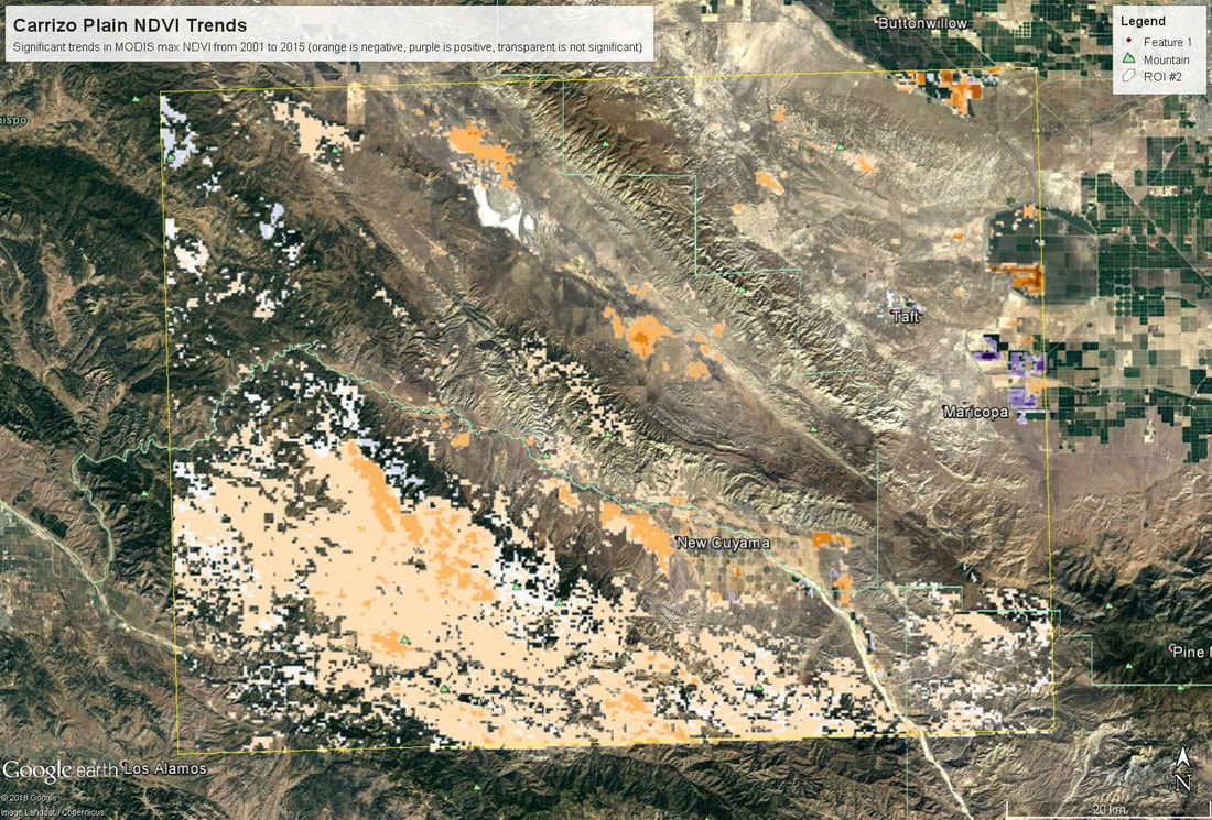 Map of trends in annual maximum NDVI from 2001 to 2015 across the Carrizo Plain region. Negative trends are orange values, positive trends are purple, and transparent areas are not significant. Overall this went pretty smoothly. Since it ran in to day 5, some students were able to fold in their own data, which was cool to see. The only major hiccup was learning that if you create a KML in R using the raster::KML function, it generates both a .kml and a .png file (I think the png holds the color info?) - and in order to look at this in Google Earth, you need both of those files to be in the same folder.
My hope is that this exercise will serve as a starting off point for students to think about other things they could map with a time series of data. What about the variance in each pixel? trends in annual minima? One thing I'm curious to try is using trend decomposition across an image (stats::stl in R), though I'm not sure how I would summarize that info to make a map that was meaningful... but it could be cool! Today is Day 2 of my teaching R in my grad level remote sensing class (for background info you might want to read the Day 1 blog post here). The goals for today were to (1) write a for-loop to read in the worldclim data; (2) make a plot; (3) write ANOTHER for-loop to stack the worldclim data for global analyses; and (4) write a function to apply using raster::calc across the globe. However, per-usual I was overly ambitious in my expectations for what we could accomplish (we also spent ~20 min reviewing exams that were handed back, which slowed us down). As a result, we made it through most of 1 and 2 (which were originally part of my plan for Day 1...), and I left the last bit of plotting to the students. For the most part the for-looping went just fine, but some students got caught up getting the file names correctly written out.
We'll pick up here in the next class meeting and talk about my favorite function in R: raster::calc. One thought - the code I've been running through is 'complete' meaning you could run the whole thing and get a nice looking plot. For stuff like plotting, though, it probably would have been better/more satisfying for students to start with a simple plot (a line or barplot) then add to it to make it more complex. It was probably hard for students to follow how and why I set up the plots the way I did (with some "n" parts). A good thought for next time! Today is the first day we're going to start working with R, and specifically raster data in R, in my graduate level remote sensing (RS) class. I thought it might be fun/useful to blog a bit about the plan, how it's going, and to post the code (link). This hopefully will be useful to me when I teach this again in a couple of years. You can see the course syllabus on the teaching page of this website (direct link), but a general overview is: GEO 837 Remote Sensing of the Biosphere is a graduate level course focused on developing RS skills for applications across campus. Students typically come from our department (Geography, Environment, and Spatial Sciences) but also from departments in the Colleges of Natural Sciences and Ag and Natural Resources. There are 13 students enrolled in the class this semester, and we meet for 80 minutes twice a week. We are halfway through the semester, and thus far we have focused on building skills in ENVI and Google Earth Engine, now we're moving in to working in R, which we will do for at least 5 class meetings. By show of hands today I did a quick assessment - everyone has done some coding, more than half have worked some in R, about a third spend most of their data analysis time working in R, and one was familiar with the 'tidyverse' (just as a check for how deep people have gone into the R universe). In the course overall students have picked a geographic location somewhere on the globe, selected an area (polygon) they're interested in, and downloaded at least two Landsat scenes from USGS Earth Explorer for that area (one from the past few years, one from the 1980s or 1990s). The minimum goal for the course is for students to map land cover on those two images then do change detection, and write this up as their final project. The task for R day 1 (running in to R day 2; days 17 and 18 of the course) is to build a climatology figure like the one below for each students' site using Worldclim2 data (worldclim.org). For speed and data storage reasons students do this using the 10 minute product (which I already downloaded and unzipped) but all of the code should run just as well on the higher resolution versions, just slower. I have been using the Carrizo Plain in southern California as an example this semester because it has some cool ecological phenomena that I'm interested in. 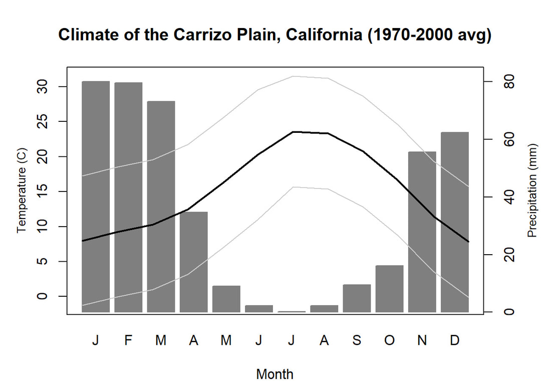 Carrizo Plain, California, climate averages for 1970 to 2000 based on worldclim data. Bars are precipiation, black line is mean temperature, grey lines are maximum and minimum temperatures. As always, there were some unexpected challenges in working through this as a class. As is typical, typos are the most common issue people have, which can be hard to spot when you're the one doing the typing. I try to pause every 5-10 minutes and check on people to see who is stuck (students have blue and red sticky notes to indicate stuck-ness, too, but without an additional instructor to help, we still take breaks). Then we ran into a few issues with the reading in of the KMZ file, with unzipping to KML (fixed in the version of the code on github), but generally for the purposes of this project we just want to create an extent object and get a general idea of the climate, so it's not essential that it is exact. We ended R Day 1 with plotting the extent on to the first average temperature raster. At the next class meeting we will pick up again there to make a data matrix and write a for-loop to read in and summarize all of the data, and make a plot. Woohoo! This weekend a new paper by me (Kyla) and Toby Ault (Cornell, Dep of Earth & Atmospheric Sciences; http://ecrl.eas.cornell.edu/) was published in the International Journal of Applied Earth Observations and Geoinformation. Toby and I started talking about these ideas waaaaaay back when we were both ASP postdocs at NCAR. After many iterations, discussions about how to best represent these concepts, some interesting other works that came out in a similar vein (namely Zhu et al. (2017) and Gonsamo et al. (2016)), and more iterations, here it finally is: https://www.sciencedirect.com/science/article/pii/S0303243418301892 (you should also be able to access here: https://doi.org/10.1016/j.jag.2018.02.017 and it should be available for free for a while but the link hasn't been working all that great: https://authors.elsevier.com/a/1WhaE14ynSEdN4 ! (paywalled after 4/29/2018 – sorry! If you don’t have access and want to read it please email me) The very short version of the paper is that while we have long understood the idea of atmospheric teleconnections, we know less about the connections between these climatic patterns and terrestrial ecosystems, and there are lots of interesting patterns to be found. The four teleconnection modes we considered (El Nino/Southern Oscillation (ENSO), the North Atlantic Oscillation (NAO), the Atlantic Meridional Mode (AMM), and the Indian Ocean Dipole Mode (IODM)) have really interesting and really widespread correlations with leaf area index (LAI3g; Zhu et al., 2013) when you use a method that allows for variation in lag times, types of correlations (min, mean, max), etc, even with a pretty restrictive set of rules about what counts as a significant correlation (we eliminated non-statistical significance, obv, but also removed patches that were equal to or smaller than what you would expect to find randomly). Our hope is that the maps in this paper will inspire ecologists and land manager-types to think a bit beyond just ENSO when they think about long-term climate patterns impacting ecosystems. To that end, we’ve posted all of the geoTIFFs behind the figures in the paper online on FigShare (https://doi.org/10.6084/m9.figshare.5948404.v1) so folks can download them and zoom in on areas they are particularly interested in. The figures (especially the rainbow one) are also a bit hard to visually interpret in the published paper, so downloading the data behind them will hopefully make them easier to think about. To that end, I thought I’d make a few zoomed in figures here to highlight some interesting parts of the paper and maybe spark some ideas. Note: I picked and chose what other landmarks/boundaries to add to the maps to make them hopefully easier to interpret. Sorry if you don't find the added layers useful! The Amazon: There are LOTS of conversations happening about what is going on in the Amazon (not our area of expertise). We took a very data-driven approach to looking for patterns, and we show a clear difference in responses between the northern and southern Amazon. Because I’m interested in savanna ecosystems, I was particularly interested in the clear signal from ENSO in the Roraima savanna area of northern Brazil, southern Venezuela (La Gran Sabana) and western Guyana. 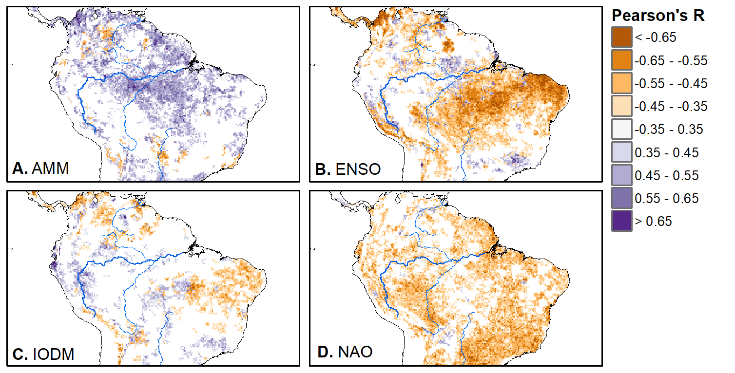 East Africa: OK, so, ENSO and the IODM are statistically correlated (see Fig S2 in paper) but it was surprising to us (though not to plenty of other people in the literature) that the signal from the IODM is so much stronger in East Africa than the signal from ENSO. These are two fairly independent climate patterns, and while there’s a decent amount of climate literature tying the IODM to precip patterns in East Africa, the bulk of the ecological literature seems pretty focused on ENSO. It’s probably worth thinking more about some of these less well known climatic phenomena. 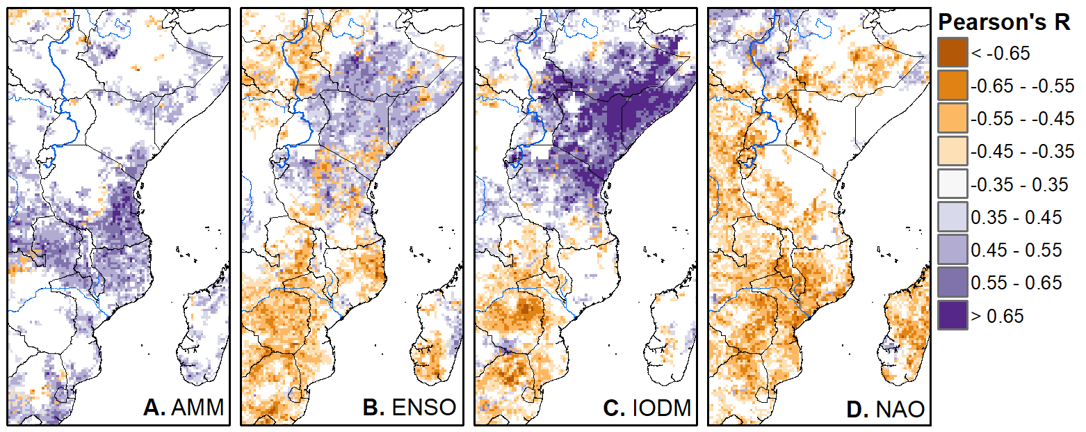 Central North America: These maps are pretty interesting in that they confirm a lot of what we already know about ENSO (strong connections in the SW US and Mexico) and therefore suggest that the approach we took works, but they also raise some interesting questions. For instance, what’s up with the central Midwest and the NAO? The AMM and eastern Colorado? 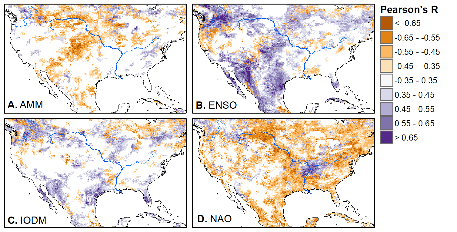 We hope that this first global-scale study of these four teleconnection patterns and their links to LAI lead to more detailed studies about particular areas and their long-term connections to climate. We also think that these patterns could potentially help inform Earth system models as 'second-order benchmarks'. It would be interesting to see, for example, if an Earth system model could capture the spatiotemporal patterns of the connections between a climate teleconnection and LAI, independent of the magnitudes of different indices.
REFERENCES
I spent the better part of last week wrangling MODIS and other data to get them all into the same projections, so I thought I’d write a quick post on how it all ended up working out, mostly so I don’t forget for next time.
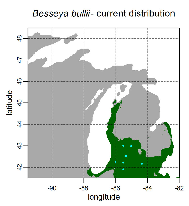
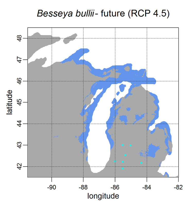
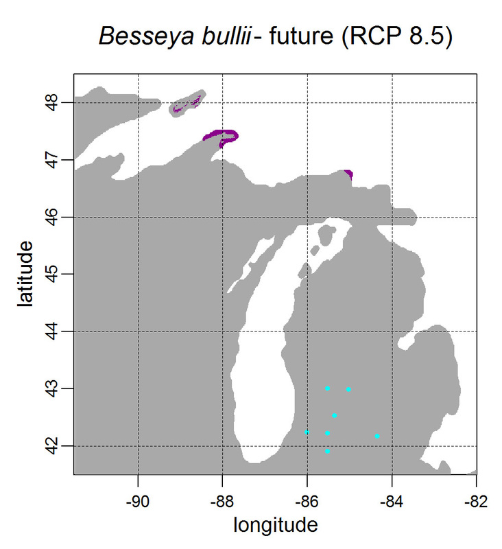
First, for MODIS data there’s a happy tool called the MODIS Reprojection Tool (MRT) which you can download and install (good tutorial on that here). In theory you can just use its GUI to process MODIS data, but that’s only reasonable for a few areas/times, so I highly recommend accessing it in R. For the most part this is easy, because someone else has already dealt with this and written a nice part of the rts package (for ‘raster time series’) called ModisDownload(), which is well described here. The catch is, as always, if you want to do something out of the ordinary. I wanted annual max and range values for LAI and FPAR for 10 years (2001 – 2011) for the continental US in the Albers Equal Area projection. Sooooo… first (after MRT is installed), you just need to figure out what tiles you want, get the files list, download the .hdf files and mosaic them (HDF4, btw). My code to do that is here on git. The only complicated part was figuring out how to get the directory names off the ftp, really. [just occurred to me that I think in the near future (7/20/1016?) this will require your earthexplorer password. Not sure how that will work]. Then the plan was to read in the hdf files as rasters, apply the qc mask from the qc data, and reproject each day, stack them and calculate max and range. The problems being that hdf4 is no joke, and reprojecting takes a LONG time. But I only needed annual numbers in the new projections, so I decided to read in the hdf files as rasters, apply the masks, stack them, calculate max and range, THEN just reproject the 4 x 10 files (or, actually, stack the 4 files per year and reproject the stack). The problem with that is that as far as I know ModisDownload() doesn’t want you to just use it to convert hdf to tif (or raster), even though MRT lets you do it, and I was too lazy to figure out any of the other ways of dealing with HDF4 in R, so I called MRT from the command line within R to write temporary tifs that I could then read back in with raster. There is undoubtedly a faster way to do this, but this only took a few seconds on my desktop. So my code to do all of that is here. In all I think it took about 15 min per year (not bad since I was only doing 10 years). Now would be a good time to mention that the raster package also does this crabby thing where it likes to fill up a temporary directory if you’re opening lots of raster files. Sometimes you’ll get random messages like ‘Closing XXXXX.grid’. If you do this enough you can fill up your hard drive or really irritate your HPC admins. So, per a conversation on stackoverflow (which I can't seem to find now), I have a little chunk of code that first sets the temp directory (use rasterOptions(tmpdir = “C:/your_trash_here”)) then empties it out at the end of each loop. If you look in this aquaxterra directory on git you’ll also find a script to ingest monthly PRISM .asc files, calculate bioclimatic variables and reproject to Albers EA. Enjoy! Yesterday I started teaching R in my very small class - GEO401: Geography of Plants of North America - in order to introduce (1) programming and (2) species distribution modeling. I mentioned on twitter that I'd done so and it had gone well, and I got a lot of positive responses, so I thought I'd actually post what I'm doing here, in case it's useful to y'all. The lab is basically modeling the climate envelopes of rare plants of Michigan using present day climate (1980-2000) and two future climate scenarios (CESM-BGC RCP 4.5 and 8.5 for 2080-2099). As a side note, the class has a mix of juniors to grad students, with a wide range of backgrounds in computering. We meet for 1:20 twice per week. We've already discussed lots about controls on species distributions (climate and beyond), SDMs, and why coding is worth at least trying. We started off making sure everyone had R and RStudio loaded, then went through the rforcats.net tutorial, minus the 'lists' part, because I think that's just too confusing for new people. And not essential. We're dedicating three class meetings to this - one for getting set up and running through rforcats, then two to work on getting figures made (using red and blue sticky notes, a la software carpentry), including time with me stepping through the code on the projector. The goal is that the students will produce all of a series of figures of their plants' distributions in class, which will then be the figures they use for their final papers. Below are links to the lab instructions, the R code, and the climate data files for Michigan. If you have any constructive comments or suggestions on these, I'd love to hear them, and if you'd like to know more about how to download and process climate data for your state or for a different climate model from NEX feel free to contact me and I can send you info and/or code. DISCLAIMER: This is NOT how I would go about species distribution modeling for a scientific publication. If you're thinking about doing that, a good place to start is Elith & Leathwick (2009). The goal of this class project is just to create simple, understandable climate envelope maps for students who've never used R before. GEO401 SDM Lab Instructions SDM R Code Climate tifs (zipped) And here are some example figures as generated from the code:
On August 26 this paper, written by me with Rosie Fisher and Peter Lawrence from NCAR, was published in Biogeosciences! The 'in a nutshell' story is that I spent much of my time as a postdoc at NCAR trying to understand how the Community Land Model works with respect to drought deciduous phenology, and how it works in comparison with satellite data (using LAI3g from Zhu et al 2013). After lots of false starts, we found that the CLM lets plants in dry areas put on leaves even when it's super dry out because (massive simplification here) CLM assumes that there is always groundwater available everywhere, and this groundwater can move up to where plants can access it. IRL this is likely true in some places, not true in others, but without better soil moisture data (hello, SMAP satellite!), it's hard to say. What's important is that if dryland leaf phenology is weird, that has implications for the fire cycle, the carbon cycle, and, ultimately, the climate, so we should probably try to get a better handle on this remote corner of the CLM, though it is certainly not alone in that respect. One other key point of this paper is that this issue (anomalous dry season green up in CLM) would be really hard to uncover using a standard 'benchmarking' type of system, or even something like zonal means. We actually had a hard time recognizing that this was serious until we looked at daily CLM output (CLM is usually output monthly, though it runs on a 30 minute timestep). I'm not going to summarize the paper too much here, go read it, it's Open Access, but there is more... because tiny maps in publications make me sad, and because I want people to use this paper to convince funders to fund their work (and mine!) I've posted all of the geotiffs used to make the map figures in the paper below (with permission from Biogeosciences and from Dr. Ranga Myneni for the LAI3g-derived maps). My vision is that if you study, say, Tanzania, you could, without too much heartache, download these figures, subset to your area of interest, and then include in a proposal or paper something like "See! We need more $ to study phenology in Tanzania because look how terribly this big important model does at predicting it!?"
I think that with relatively basic skills in GIS or R you should be able to download these and check them out. If you try it and have issues, please email me and I'll try to help. They're all on a grid from -180 to 180 longitude, -90 to 90 latitude, with a grid cell size of 1.25 by 0.9375. Enjoy! Note, if you do use these, please make sure to cite my paper, Zhu et al 2013 (they're both OA), and Giglio et al 2013 for the fire data. Note that the LAI3g data is available at much higher resolution (1/12 degree), if you need it, as is the GFED4 fire data (0.25 degree). Figure 1B - % cover of drought deciduous plants in CLM Figure 6 = Avg. maximum annual LAI from 1982 to 2010 (so, I calculated the max for each year then took the mean of those 29 max values). I'm not providing the difference maps just to save space, but I'm happy to provide them if you don't want to make them yourself. Figure 6A - LAI3g Figure 6C - CLM4.5BGC Figure 6E - CLM-MOD Figure 7 = Mode # of peaks in each year in the three data sets, not including spots with an annual range of <1 LAI unit. Figure 7A- LAI3g Figure 7B - CLM4.5BGC Figure 7C - CLM-MOD Figure 8 = Point-wise correlations between the different data sets. Grid cells set to zero here = not significant. Figure 8A - LAI3g & CLM4.5BGC Figure 8B - LAI3g & CLM-MOD Figure 9 = Looking at average burned area fraction per year in GFED4 and CLM. Figure 9A - GFED4 - the data is from here. Figure 9B - CLM4.5BGC Figure 9C - CLM-MOD By the time this is posted I will have finished my ESA talk, and a link to the slides is posted here. I'm going to attempt to summarize what I talked about (technically what I'm planning on talking about) here.
One of the things I'm interested in is how imaging spectroscopy (== hyperspectral imagery) can inform fundamental questions in community ecology and biogeography. Since I now live in flat, agriculture-dominated Michigan, I'm curious if this particular landscape can tell us anything useful. Hence, this year at #ESA100 I talked about "Hyperspectral imagery for biodiversity mapping in a wildland-agriculture matrix." Broadly, one of the questions many of us would like an answer to is "Why do plants grow where they grow?" and, critically, "Can we predict where plants will grow in the future?" One way I like to think about this is that when we have an observed landscape, we can divide its influences into a number of different categories, and we'd like to know which ones dominate a given landscape at a given scale. But five influences is too complicated, so I really like this diagram from Weiher & Keddy (1995, Oikos) putting environmental and competitive diversity on a single access. One way to think of this is then a random landscape would just look like noise, while a strongly environmentally filtered landscape would look extremely patchy (see: California. Also, caveat, things other than environmental filtering (like disturbance) can create a patchy landscape. This is not a perfect setup.) From the biogeography side we have the species-area relationship (SAR), which, while much beleaguered, can reveal interesting things about a landscape, especially when compared to some null expectation. Recently Smith et al (2013, Ecology) extended this idea to a functional-diversity-area relationship (FAR) and they suggest that when an actual FAR falls below their null expectation, that means it's a patchier landscape. And lots of other things (go read the paper!) Though subject to many of the same issues as the FAR, we can again use this null expectation or 'model landscape' approach to test hypotheses about the distribution of data in our landscape of interest. In this talk used my own local landscape, a mix of agriculture and mesic northern forest, as two different but intermixed landscapes - one, the mesic forest, that we'd expect to be near random. It's real wet and real pleasant in Michigan, so these plants are likely more controlled by competition for light, priority effects, etc, than they are stratified by environmental gradients (though there are probably some of those, too), so we would expect to find high alpha diversity, low beta diversity. In contrast, green agricultural fields are an EXTREMELY patchy landscape in that each field is nearly homogeneous, while between field variability undoubtedly exists due to different crops being planted, different times of planting , and different management practices, so, low alpha diversity, high-ish beta diversity. I located 'plots' (300 50x50 m plots) across this landscape, calculated principal components on the continuum removed spectral data, and looked at how the two landscapes compare. I'm essentially going to treat the first three PCs as traits. I'm fully aware that this negates a lot of the trait-based work that cares about the influence of traits on physiology, but for my purposes I'm just going to worry about spatial heterogeneity for the time being. So, what to the PCs look like and is their variance different between forest and ag? Yes, indeed. As expected, there's a lot of variation within the forest plots, and very little within the agriculture. This is no surprise, but it should be reassuring to the community ecologists that remote sensing can say something they believe. The FAR curves also match what we would expect: given the size of my plots, the variance within a single plot is essentially equal to the variance across all plots when the data is randomized (gray line on Actual v. Predicted FARs slide looking at variance), so that line is totally flat, similar to the forest line (green) while the ag line (purple) rises steeply. In contrast, the CHV lines keep going up because the range of values for all the points is really big. Enjoy and feel free to ask questions! |
ERSAM Lab ThoughtsThis is where we occasionally post things that are not research, but more than 280 characters. If you want to know what we're working on now, this would be a good place to look. Code will be linked to here and posted on github. Archives
November 2018
Categories |

 RSS Feed